Are you paying for an online vitamin subscription when you only wanted to try one bottle? Or did you end up with more items than you bargained for in an online shopping cart after jumping on a single hot deal?
You might have been tricked by “dark patterns.”
Retailers, travel sites and other online services use dark patterns that not only annoy and frustrate us, but as a Princeton study found, can also:
- Mislead us into spending more than we plan.
- Trigger compulsive behavior.
- Trick us into sharing our personal information.
- Keep us sticking around their websites or apps.
Some dark patterns are more common in mobile apps than on websites, the FTC says. California recently banned some dark pattern practices.
User experience designer Harry Brignull coined the term “dark patterns” in 2010 and now calls them “deceptive design.” He’s got a list of tactics and a hall of shame on his website, Deceptive Design. Most are simply cheap tricks relying on us skimming websites and apps instead of reading their content carefully. Knowing about dark patterns is your best defense against falling prey to them, he says.
British payment processing analyst Merchant Machine recently ranked the worst dark pattern offenders it found after visiting 72 popular online retailers. Its researchers mimicked real online experiences by adding items to shopping carts or making hotel bookings. They followed user journeys all the way to checkout and counted each dark pattern.
Here are some of the top tactics and the brands guilty of using them, according to Merchant Machine.
‘Sneak Into Basket’

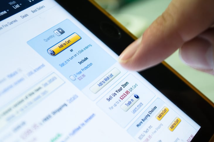
Double check what’s in your shopping cart before you click “buy.” Online stores sometimes sneak unwanted products into your cart without you realizing it.
“This can happen if you miss an opt-out button on a previous page or a combo deal is offered right next to the product you actually want,” Merchant Machine says. Sites might also add product protection plans and other ancillary items you forget to decline.
At Amazon, for example, an auto-tick for a subscription can make you pay more than expected by default, Merchant Machine warns. Also look for grayed-out checkboxes that your eye moves past toward more-expensive buying options.
‘Privacy Zuckering’

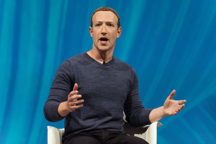
Named after Facebook founder Mark Zuckerberg for that website’s early practice of collecting users’ data, Privacy Zuckering “lures you into sharing more private information than you’re comfortable with,” Merchant Machine says.
When you use a service, like a store credit card, the small print hidden in the terms and conditions gives them permission to sell your personal data to anyone, Deceptive Design warns. You might also be asked to share your contacts under the premise that the coveted data will make it easier to connect with friends.
Data brokers buy your personal data and combine it with everything else they find about you. Your profile could contain your sexual preferences, and information on physical and mental health. This profile could result in your being turned down for insurance or a loan, the payment processing analyst says.
Puma, Merchant Machine found, slips into your inbox by offering a 20% discount if you sign up for its mailing list. (This is also an example of the “misdirection” tactic.)
In 2015, LinkedIn agreed to pay $13 million to settle a class-action lawsuit by members who shared their contacts with the site. Members alleged LinkedIn used their names to embarrassingly spam contacts with invitations and reminders to join the site.
Blogger Dan Schlosser famously accused LinkedIn of using dark patterns to get members to share their address books in the first place. This is a dark pattern known as “friend spam.” LinkedIn later changed the appearance of its contact-sharing appeal.
‘Confirmshaming’

If loaded language guilts you into agreeing to something you’d rather not do, including opting into a subscription service, you’ve succumbed to confirmshaming.
Cosmetics seller Anastasia Beverly Hills has eight dark patterns on its website, says Merchant Machine — the most of all the beauty brands it studied. One dark pattern offers the customer a discount for signing up for promotions via texts. To decline, you must press a guilt-tripping “I’ll pay full price” button.
In a recent blog post, Zarina Majidova, a user interface (UI) and user experience (UX) designer, called confirmshaming “a passive-aggressive marketing strategy that implies that you are inferior just because you do not want a particular product.”
She cites examples including Esquire magazine offering to unlock a list of 80 must-read books in exchange for your email. The no button says “I don’t read.” A styling company offering a discount to get started on its service makes you press “No thanks, I don’t want to look my best” to say no.
‘Forced Continuity’

Watch out for those allegedly free 30-day trial offers that require you to provide credit card details upfront. With forced continuity tactics, a company will keep charging you even when you no longer want the service, like when the free trial is up.
You might simply forget to cancel, but the company might also make it tough to learn how to cancel the no-longer-free trial, and count on you being too busy and frustrated to fix it.
The Instacart grocery delivery service’s five dark patterns includes a “nasty surprise,” says Merchant Machine: an automatic $99 credit card charge if you fail to cancel your two-week Instacart+ free trial on time.
The Federal Trade Commission and the Consumer Financial Protection Bureau recently announced a crackdown on the “the growing scourge of dark pattern practices.”
“Consumers shouldn’t have to jump through hoops to cancel subscriptions they don’t want, and they shouldn’t have to worry about a trial marketing offer turning into an unwanted monthly charge,” CFPB Director Rohit Chopra said.
‘Hidden Costs’

What looks like a bargain can become expensive when you discover only at checkout that the low price you thought you’d pay becomes expensive due to last-minute additions of taxes, delivery charges or essential extras.
Besides scaring you with fake warnings about possible instant price changes and near sellouts of bargain travel deals so you’ll hurry up and book a room or flight, travel sites such as Hotels.com, Vrbo, Expedia and Travelocity (owned by Expedia) show taxes and fees added at checkout, Merchant Machine says. They also hit you with confirmshaming to get you to add travel insurance.
You might not see the hidden costs such as delivery and “care and handling” fees until you reach a “review order” page, says Deceptive Design. By then you’ve invested a lot of time choosing an item, entering the delivery name, address and phone number, your credit card details, your own name and address and phone number.
“By the time the hidden costs are revealed, you’ve already invested a great deal of effort and you’re likely to feel fatigued,” says Deceptive Design. You’d likely rather complete the purchase than start all over again with another website.
The worst offending brands

Here are the worst offending brands according to Merchant Machine, along with the number of dark patterns it found:
- Amazon: 11
- Anastasia Beverly Hills: 8
- Florence by Mills: 7
- Glossier: 5
- Urban Decay: 5
- Lancome: 5
- Instacart: 5
- Under Armour: 5
- Colour Pop: 4
- Kylie Cosmetics: 4
- Fenty Beauty: 4
- NYX Cosmetics: 4
- Too Faced: 4
- Walmart: 4
- Puma: 4
- Asics: 4
- Reebok: 4
- Fila: 4
- Hotels.com: 4
- Vrbo: 4
- Expedia: 4
- Travelocity: 4
And those are just some of the tricks you face online. Make sure to learn about “10 Retail Sales Tricks That Are Making You Overspend” too.
